Android And The Screen Size Dilemma.
Mine is 10.1 inches. How big is yours? I’m taking about Android Screen Size of course!
You didn’t think I was being dirty there did you? The ladies would be happy tho, wouldn’t they haha! Android screen size is a pretty big consideration when designing any app for Android.
I have the aptly named Samsung Galaxy Tab 10.1 wi-fi version. Not surprisingly it has a 10.1 inch screen. I also have to hand a Samsung Galaxy Ace and an HTC Desire HD. All 3 have different screen sizes. That’s the first problem when developing for Android OS: Every manufacturer can use their own custom screen size if they want – and there are many, many different sizes.
There are a few other initial problems to take into account too: namely the OS version running on the device. I did write a bit about this problem for this post but it got too long. I have moved it to its own post here: Android And The Software Version Dilemma.
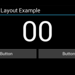
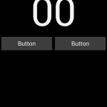
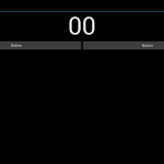
The Android API has a few ways to cope with this wide range of differing screen sizes. Take this scenario: You have a simple stopwatch style app. It’s only got 3 items on the screen: a counter, start button and stop button. A typical layout for this would be the counter on the top row, centred, and the 2 buttons side by side below taking up the full width of the screen. Android has a very handy, very simple, way of doing this that works for all screen sizes: Firstly I will need 2 LinearLayouts one being Vertical and one being Horizontal. The counter (I’m using the Chronometer widget but it could be a label if you kept count a different way) goes into the Vertical one, Buttons in the Horizontal one. As you would imagine items in the vertical layout stack up and down, in the horizontal one they stack left to right. Set the layout_width of both the LinearLayouts to match_parent – that makes it stretch the whole width of the screen. Next add a layout_weight property to both of the buttons and set the value to “50” for both of them. You can use the layout_weight property like a percentage property because the default overall weight is “100” units. That’s the layout done, it works on all screen sizes in all 4 orientations. Each button is 50% of the width of the parent (the horizontal LinearLayout) and the parent always matches the screen size because we set the width of it to match its parent (the screen).
Setting properties is easy in Android, it’s done with an .XML file and added like this: android:layout_width="match_parent".
Here’s the .xml file that contains out layout along with some comments:
<?xml version="1.0" encoding="utf-8"?>
<LinearLayout xmlns:android="http://schemas.android.com/apk/res/android"
 android:layout_width="fill_parent"
 android:layout_height="fill_parent"
 android:orientation="vertical" >
<Chronometer
 android:id="@+id/chronometer1"
 android:layout_width="wrap_content"
 android:layout_height="wrap_content"
 android:layout_gravity="center_horizontal"
 android:text="Chronometer"
 android:textSize="120dp" />
<LinearLayout
 android:layout_width="match_parent"
 android:layout_height="wrap_content" >
<Button
 android:id="@+id/button1"
 android:layout_width="wrap_content"
 android:layout_weight="50"
 android:layout_height="wrap_content"
 android:text="Button" />
<Button
 android:id="@+id/button2"
 android:layout_width="wrap_content"
 android:layout_weight="50"
 android:layout_height="wrap_content"
 android:text="Button" />
</LinearLayout>
</LinearLayout>
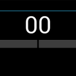
- Here is what the simple layout in our theoretical Timer App looks like in Portrait mode on a tablet
- Here is what the simple layout in our theoretical Timer App looks like in Landscape on Nexus One screensize mode
- Here is what the simple layout in our theoretical Timer App looks like in Portrait mode
- Fixed screenshot of 10 inch tablet displaying a example layout for multiple screen sizes.




Pingback: Android Timer Demo (Android Stopwatch Example - Toothbrush Timer)
Pingback: Android Games and Android Development