Floating Jetpack Social Share Buttons In Responsive Design
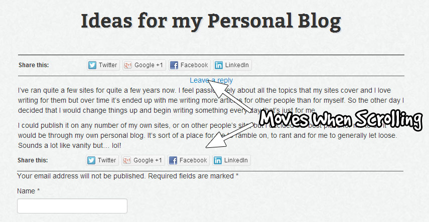
UPDATE: You can now demo the floating social buttons created in this post on this very site. Scroll down the page and you’ll see them in action. Send me an email if you have problems adding these to your own site and I’ll help you get it done. 🙂
A few months back I was inspired by the floating social share buttons I seen on WPBeginner. I contacted them about the buttons and was told that they would be covering how they done it in a future tutorial. They never did, so I decided to make my own.
I used jQuery to make a div float and placed my share buttons in that. It worked a treat but when placed in a responsive design there were issues getting the right width for the right screen size. If I did not require a responsive solution it would have been perfect but responsive design is a necessary part of web development now with so many of you using your phone for browsing.
So yesterday I decided I would take another look at how I’d done it and try find a workaround for the responsive issues. I decided the approach I would use would be to set the width of the share div to be the same width as the content div it was in at load – so the initial screen size was accounted for and the width would respond accordingly.
I have since opted for a method that detects window re-size and makes the div respond to the size change. You can read about the re-size JavaScript code in a future article.
This time instead of looking out my old jQuery code I would use Bootstrap’s affix plugin. It does the same job. And instead of installing ShareDaddy, which is now merged with Jetpack I would use it through Jetpack.
Moving Jetpack Share Buttons
Jetpack shared a post last week about how to move the share & like buttons which you can reference if you need to.
The share buttons in Jetpack get added to the end of the post content so you need to start by filtering that out. Add this to your functions.php file.
function jptweak_remove_share() {
remove_filter( 'the_content', 'sharing_display',19 );
remove_filter( 'the_excerpt', 'sharing_display',19 );
remove_filter( 'the_content', array( 'Jetpack_Likes', 'post_likes' ), 30, 1 );
}

add_action( 'loop_end', 'jptweak_remove_share' );
Place The Share Buttons
Then you need to open up single.php and find the place where you want to add the buttons and paste this markup which is the share buttons inside a div inside another div.
<div id="social">
<div id="social-block">
<?php if ( function_exists( 'sharing_display' ) ) {
sharing_display( '', true );
}
if ( class_exists( 'Jetpack_Likes' ) ) {
$custom_likes = new Jetpack_Likes;
echo $custom_likes->post_likes( '' );
} ?>
</div>
</div>
Make The Jetpack Social Share Buttons Float
The next thing you need to do is include a script to trigger the share buttons to float. This assumes you’ve already got the affix plugin and jQuery loaded. If you haven’t check out this post I’m going to write about including them.
In the script we also do a couple of other things:
- We set the height of the
#socialdiv to the same size as the#social-blockwhen it’s pulled from the flow. That means our content won’t jump when the buttons begin to float. - We set the width of the
#social-blockto be the same as the width of the main content container, which in my case is.primary.
Paste this in it’s own file and call it social-float.js. Save it in a folder named ‘js’ in your theme, Bootstrap comes with a ‘js’ folder so you probably already have a folder called that in your theme.
Each line is commented to tell you what it does.
var $ = jQuery.noConflict(); // set the $ variable to be jQuery

$('#social').height($("#social-block").height()); // sets #social to the same width as #social-block
$('#social-block').width($("#primary").width()); // sets width of the div with buttons to be the same as it's main container
$('#social-block').affix({
offset: $('#social-block').position()
}); // affixes the div whenever scroll past it
Include the Floating Social Script in your Theme
Paste the following function in your functions.php file and our script will be included on every page of our theme. We could go a little farther and specify it only to include on single pages but for now it’s fine to include it on every page.
function enqueue_floating_script() {
wp_enqueue_script( 'social-float', get_template_directory_uri() . '/js/social-float.js', true);
}
add_action('wp_enqueue_scripts', 'enqueue_floating_script');
Style the Floating Div and Position It
All that’s left to do now is give the div containing your buttons some style and to tell it the position it’s to fix itself to. What that does is add the .affix class to the div, which already contains position:fixed; all we need to do is tell it the position we want it to fix to.
Open up your style.css file and paste this:
#social-block{
border-bottom:1px solid #555555;
border-top:1px solid #222222;
background-image:url('img/paper_fibers.png');
}
#social-block.affix {
top: 0;
border-top:0;
}
In my design I have a background image which I replicated in the #social-block but you might want to just use a background:#fff; syntax. I added a top & bottom border to it too and I remove the top border when it turns fixed because it didn’t look right.
The final product can be seen here running on the theme-dev single pages and now on the PattonWebz site too (the one your currently on).
The Best Bootstrap Theme


I’ve moved away from JetPack and Shareaholic because they really big site resources. My new weapon of social media sharing choice is “Flare”.
hmm… I’m not too keep on Flare, the buttons seem to load very slowly to me and it causes me to get a weird kind of ‘scrolling pop’ when I visit a site using it – even through the buttons don’t affect the vertical flow of the page :s
By the end of this tutorial you will end up with something similar to the page above. It is a very plain design, but it will do the trick for now. It is fairly easy to clone the image as seen above, but the main goal here is to make it responsive. To make the website respond based on the size of your device’s screen size.
By the end of this tutorial you will end up with something similar to the page above. It is a very plain design, but it will do the trick for now. It is fairly easy to clone the image as seen above, but the main goal here is to make it responsive. To make the website respond based on the size of your device’s screen size.